Typography Revisit Process

Standard

With our overwhelmingly busy schedules, it can be hard to manage our time outside of class. It is very important though to keep on top of all our revisits, to build better projects to showcase in our upcoming final exhibition.

That leads into the first project I decided to make changes to before putting it in the show. My third year exhibition poster featured main type that had to be manually constructed. The concept and main type really fit the feel of the objective. The challenge, was that when integrating the secondary type, it began to feel too different and take away from the main focus.

Type Exhibition Redo

Before and after of my Type Exhibition Poster Revisit.

That’s why I’ve worked to really tone back the secondary headline text, to play a more supportive role where it doesn’t take the visual focus away. I also decided to move all of the informative text to the bottom, in order to create more hierarchy on the main text.

I chose a more in depth project that had a double sided poster program to revisit next:  Acting Out Claiming Space. It also had banner advertisements and a catalogue that featured a review of the events that took place. For this revisit I wanted to integrate the design policies I developed with the catalogue and banner ads, bringing them back to the main poster.

Acting Out, Claiming Space Poster Redo

Before and after of my Acting Out, Claiming Space Poster Revisit.

I have finished the design changes to the front of the poster and am now working on carrying that through to the back. I am also rearranging space in the catalogue to make room for the possibility of highlighting certain elements with drop quotes. Another way to add more interest to the catalogue is to introduce the use of colour throughout the text.

The third project I’m revisiting, is on the fictional type conference I was assigned, Troubled Waters. We worked on a front cover for the conference, and an inside schedule that worked off of the same design policy. We also worked with carrying on the look through to a standing banner ad and 2 web pages. In this revisit I’ll be working to make slight adjustments to the inside spread and changing the web pages to a more realistic size. These changes are still in progress, but these are the pieces that most of the changes will be focused on.

Troubled Waters things to redo

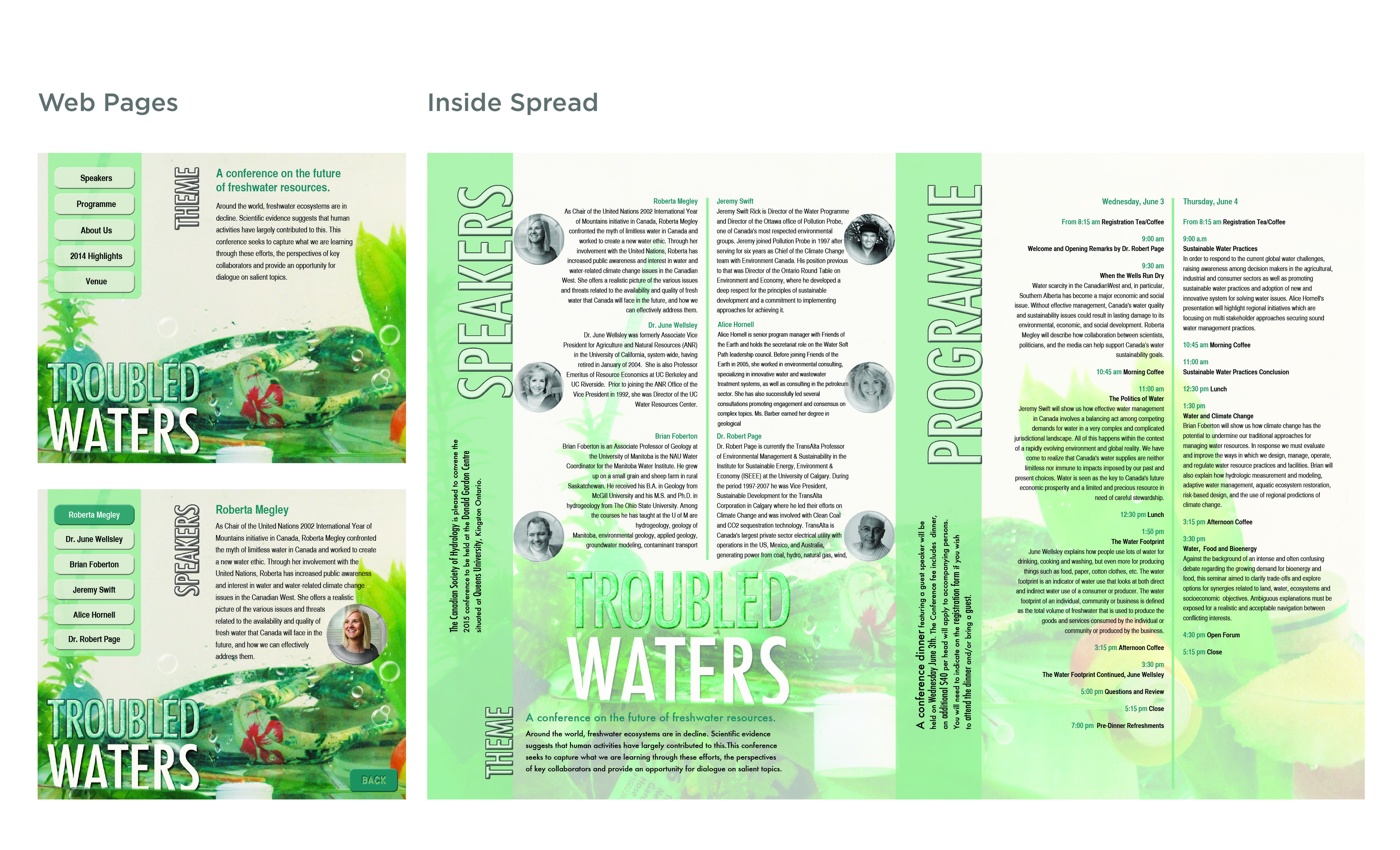
Two web pages and inside spread that I will be making changes to for the revisit.

Revisiting projects can be a challenge, sometimes you are stuck on your original idea, or you aren’t sure of the best changes to make. After deciding on all my changes and being well into the work, I’m confident on the process of my type revisits so far. I can’t wait to have these pieces of work to show after all the changes are complete.

Jess.

Illustration Revisit Process

Standard

For our final semester of school we are completing quite a few project revisits. For my illustration revisit I will be working on one project, but it will be completely redo. This will be a Children’s Book illustration project which included one spread and the book cover. The main objective of this project is to create a fun and audience appropriate illustration, while making sure the story is well understood both through the type and the graphics.

For my original project I did Winnie The Pooh, I choose this topic because it is close to my heart which was a big mistake. I know too much about Winnie The Pooh and different styles of the different characters. I then struggled with creating something that made the characters different enough from the original.

Old Children's Book Illustration

This was my old cover and inside spread for the Children’s Book Illustration.

For my revisit I have chosen a completely new idea. I have chosen ‘Little Groot’ from the Marvel movie ‘Guardians of the Galaxy’. Groot is one of the main characters, without spoiling the movie, at the end he ends up as a ‘Little Groot’ which you’ll have to watch to see how. I find the character adorable, cute, and loveable; which are all great characteristics of a perfect children’s book character.

This is why I chose to create my own Little Groot, more of a cartoon version that has a soft and simple look. I have finished the basic illustration of my Little Groot character and am happy with the look and feel it has. The final piece I have to finish to the actual character is his pot he sits in, which may become the lead concept of the story. My main challenge right now is just figuring out the supporting elements and the type formatting. I have explored different ideas with my mood board below.

Little Groot Mood Board

This is the mood board I created to generate ideas for my revisit.

I looked at Little Groot from the movie, and other interpretations of Little Groot. There are also images I found from an illustrated book about an onion. I like how they have illustrations and elements that kind of interact with the gutter, and want to consider that as a possibility for my final spread. The front of the book was also very interesting with how the onion can open up before from the middle of the book. For the colour palette I have a mix of greens and browns for Groot. For the secondary colours in the spread I’m looking at pastel colours. For the type I tried a couple of fonts for the main titles. I also looked at examples online and I like the idea of the three dimensional look. I’ve also considered using wood imagery and masking out the type from the image.

Over all, things are going according to plan with the completion of the main character. Now my main focus is finalizing the story concept, choosing the direction for the type and then integrating the background.

Process Work for my Little Groot Character:

Little Groot Character Process

This is some of the main transitional process on the illustration for my Little Groot Character

Jess.


Image sources from my mood board:

Package Design

Standard

Something that has really caught my interest of late is package design. Now that we have a project for package design and are planning on designing a package for another class, it has come to the fore front. I’m always looking at new things on Pinterest, every time I go on, I see a new kind of beautifully designed package.

Packages never really stood out that much to me, but now being in design it is really important to me. A nicely designed and well thought out package can really sell a product over. I think that package design should be of more importance to companies. Creating a package that is successful and works better for their customer can make them choose that product over the competition. Creating an eye-catching and creative package isn’t just about it looking nice, or being pretty to look at. It means creating something that the customer remembers you by, and ads value to your brand.

Check out my Package Design board on Pinterest here.

So how do you create an innovated package that stand out from the rest? You have to create something that works for the intended user. Something that meets their needs and that you can design to make visibly pleasing where they can spot it quickly on the shelf. I’ve seen some very interesting and well thought out packaging designs online. They relate to the product, showcase it well, and are extremely eye catching. I wish all packages looked like this. When buying products that are all very simile in nature, it really just comes down to the difference of brand. If one of those products had a package that was useful, or was designed where you didn’t want to get rid of it, it would definitely influence my purchasing.

Interesting concept for recycling an old product and turning it into a new containment for something related.

Interesting concept for recycling an old product and turning it into a new containment for something related.

Think about creating a package that can be used, or kept to enhance the product. This really draws attention to it, and to the details put into it. Design consciously for the product, and think with endless possibilities, to make something creative. Think of the best way to represent the product, and the brand overall.

What do you look for in a successful package, and do you find packaging ever influences your buying tendencies?

Usable chocolate box design.

Usable and unique chocolate box design.

Fun and interesting way to draw attention and make this package stand out from others.

Fun and interesting way to draw attention and make this package stand out from others.

Jess.

Inspiration

Standard

When you lose your focus on something or are trying to come up with ideas, we all need inspiration. Everyone finds inspiration through different things, but it is one of the most important things to keep at the forefront. Yes, you can perform work without inspiration, but it will lack your personality. Not only that, it won’t show the passion that you normally posses. Inspiration works hand in hand with the passion that we feel for an idea.

Inspire Your Ideas

Inspire Your Ideas

When you are passionate about your idea or your work it shows. It shines through in the design, the effort you put in, even the feeling you give off when you talk about it. When you are inspired and passionate about something, you are confident about it. You believe in what you have created and this is what you need to make your client believe in it. You have to believe in the solution you’ve created and sell it to them.

Throughout our lives there will probably be work we have to create and don’t feel overly  passionate for. But when we get into situations like this you have to be able to find that inspiration and motivate yourself. You must skillfully use your inspirations in life to inspire you through anything you create. You can find inspiration in almost anything, you just have to look close enough and dig deep enough.

When I’m feeling lost with a project or with coming up with an idea, I turn to music. That is my one thing that I can always rely on. It can always help me refocus, even if I’m in a completely different world with my ideas. I think everyone needs at least one thing to be able to bring them back to their ideas. If you don’t already know what that is, try to figure it out. Try to think about what your mind drifts to when you’re working on something and you start to get lost. If you make that your inspiration then you can build the passion you have for that into your work.

My Inspirations

Some of my Inspirations

I would hardly say that I’m an expert in how to inspire yourself. I’m just sharing how important I think it is to be inspired. Losing your inspiration is like losing your mojo: you have to get it back at all cost. This is simply the way I’m able to  find passion in most

everything I do. When I turn to music I can feel my inspiration stirring from the beat, the lyrics, or just simply how it makes me feel.

Jess.

Well Hello Again.

Standard

I know it has been a while since I’ve last posted on here but, I’m back. I have just started back in school and it is finally our third, and final year of Graphic Design. This is an exciting and scary thing to think about. Part of me is excited to be coming close to the end of something I have put so much into, and worked so hard on. I am also very excited for what’s to come after this, wether it be the workplace or more school. But the other part of me is scared of just that, what am I going to do after? I have many ideas, and ambitions of what I want to happen, or what could happen. That’s the thing though, plans can change at any time and what happens is so undefined.

First Day Back at School for Third Year

First Day Back at School for Third Year

I’m glad that we are back to writing on our blogs, because I think it’s a great outlet for us to discuss the things in our design lives. That’s exactly what I have chosen to do with this post. I wanted to talk about the things most of us are probably thinking about right now… the future. I think as all of us start to come to the end of our program, we will all be thinking about where this leaves us after. This can be good or bad for us. There is a certain amount that you can think about the future before you start to stress yourself out. Yes, there are certain things we should be planning now, and specific things we should prepare for. But if we focus too much on what is going to happen once we graduate, we won’t focus enough on one of the most important years that’s right in front of us now.

As we begin our final year, we are building our online profiles, putting ourselves out in the real world of design, and working our butts off. This is what we all have to focus on. Yes we have to worry about the future, but there’s time for that later.. and quite literally in the future. I was talking to an old professor recently, and what stood out the most from our conversation was when he told me to enjoy this last year. That yes it’s going to be busy, but to make sure you also allow yourself the time to enjoy it and still have quality time with your friends. I think this was the best advice I could have been given, because yes we have to put in the work to reap the benefits of our program, but don’t let this year pass you by.

books

Organized for School

Year three is going to be filled with everything: projects, stress, late nights, social events, work, time with our friends, life problems, and much more. Life is busy and hard, and sometimes things happen that suck or that throw you off. Most importantly, the future for us after this final year is going to be different for everyone involved. I think everyone should just keep in mind that we can all do this, as long as you have the passion for what we do. Yes, the future definitely scares me, and the stress of our workload scares me too. However, I’m confident that I’ll be fine after because I’ll keep working hard, enjoying my final year, and leave figuring out my future for a little bit later down the road.

Jess.

Coming to an End

Standard

It’s odd to think that in a week we will be done our second year of Graphic Design. I can remember the first day of second year like it was yesterday. Between all the design challenges I’ve faced, the late nights and early mornings it has been a busy but interesting ride. It has also been a ride that has gone by rather quickly. When we started this blog at the beginning of second semester I thought it would be a good experience to explore more into the design world. I am very active in social media and blogging already, so having a blog isn’t new to me.

First day of second year in our new cubicles

First day of second year in our new cubicles

What was new to me was discussing design in my blogging. I am heavily influenced by music, whether it be in my photography, or design. I have a blog dedicated to my experiences with music but I have never had anything specifically for design. I’ve always been very confident when talking about music because of the background I have with it, and knowing that you have people that are interested about what you’re writing gives you the confidence to write it. Before we started this blogging assignment I didn’t think anyone would take interest in what I had to say about my thoughts on design. I’m glad we had this assignment because it has shown me that there are people who will read what I post and that it works the same way as different online communities.

I find enjoyment in sharing my experiences and thoughts on the things I am interested in. I think it’s a great way to learn from others and to discover more things in design. I’ve read posts and read up on design on websites before, but I had never done so much research behind different things. Through the research I did I have discovered many new and exciting things and ways to further my learning in design.

I can’t promise that I will stay to any set schedule or pattern for continuing this blog, but I would very much like to continue posting on it. I think it’s a great experience for new designers and a great way to put ourselves out in the design world. Through our second year of Graphic Design It has been a crazy ride. I’m ready for our third and final year, to continue learning about what I love to do, but for right now I’m most excited for our much needed break.

Thanks Jess.

Our second year exhibition showcasing our work

Our second year exhibition showcasing our work

Me with my photo book spread in our GD exhibition

Me with my photo book spread in our GD exhibition

Check out our Graphic Design second year exhibition website here.

Design Thinkers 2013 RGD Event

Standard

This week I wanted to talk about the Design Thinkers 2013 RGD conference. This past november I had the opportunity of attending and I think it was an experience every designer should take advantage of. The conference took place in Toronto and featured speakers all from various areas of design. It is known as Canada’s largest graphic design event and I think all student designers should attend at least once. Not only is it great to hear from all the speakers but it’s an opportunity to interact with all the different vendors, professionals, and other students at the event.

For the 2013 conference they had over 1,500 participants and around 25-30 speakers for the two day event. I only attended the second day but even with that I got to hear a lot of interesting perspectives on design. Out of the many speakers that we listened to some of my favorite and most memorable ones were; Karin Fong, Morag Myerscough, Ricardo Crespo, and Michael Gough. For a full list of the speakers you can visit the Design Thinkers page on it here. In between the speakers we got to go around and interact with other students, teachers, and the vendors. It was really interesting to hear different things from the vendors, about what their company does and to know that they’re there for when we work in the field. Being a student we don’t really talk about those things yet, but it’s nice to see all the different options that are out there. One of my favorite things was all the different booths on paper and the variety out there, I find it fascinating to see all different things we can work with.

I think the most important thing I learned; isn’t something thats focused, but a generalized conception, that looks into all the aspects of design. When we start pursuing design in school, we weren’t aware of all the different things that design can branch off into. I loved hearing from all the different speakers, what they do and I found it great to see all the different areas we could pursue. One of the most memorable things I took from the event, was hearing from Karin Fong of Imaginary Forces. She showed examples of her work with title design, which was something I never really even thought of before. One thing that I will never forget is when she showed us the live action trailer that she worked on for, God of War: Ascension. She went through the process of how they designed the trailer and the different things they had to consider. We always see commercials and advertisements for things like this on the television. We never really put much thought to how they were created, or the depth behind the concept of the various components. I thought it was great perspective of possible opportunities that graphic design has to offer. I never conecptualized the many possibilities of the various jobs and how much depth they have to their work.

Overall, I thought the Design Thinkers event was indefinitely worthwhile and I can’t wait for next years, so that I can attend the entire two day event. I recommend to anyone that is interested in graphic design, should attend the event next year or look at other events that RGD host.

Jess.

My lanyard from the event  Ricardo Crespo starting off day two.

Designer Interview

Standard

For our post this week we were to contact and interview a designer whose work we respect. The information received from doing so was very intriguing and opens up a new perspective that we as students don’t get to experience yet. I chose to talk to a local illustrator named Christian Wolf who designs comics and does caricatures. I chose to talk to someone who works locally to see what their experiences are like working while living here in Kingston.

The process of contacting and talking to a designer was new to me. Being a student I haven’t done much networking in the design world as of yet. It is intimidating at first to go out and contact others but it’s a great learning experience for us to put ourselves out there and expand our horizons.

The most important thing I took from the interview was really staying true to where you are most passionate in design. From a young age, Christian was highly influenced by comic books and Mad Magazine. This area of design captivated him and that’s what he stuck too while developing his skills for the past 20 years. I think when you learn new things in design it’s important to take all of that in and explore it, but I also think it’s important to really be passionate about the field that you choose in design.

Another helpful discovery I made was that when you’re in a creative rut, the best way to get out of it is to take a break. You need to clear your head and come back to it, go online and look at new things in design to keep your ideas flowing. Another big thing is to push yourself with things that motivate you like music. I find it easy to relate to Christian because we both have heavy influences from music and when I’m in a creative rut, I turn to music to help me think creatively.

The best advice I gathered from the interview was that you really have to put yourself out there in the design world, and be versatile. Don’t wait until after you are done to start doing things in design, start designing for people and making a name for yourself as soon as you can. Make sure you know your skills and your best strengths and if you work from that you can start to build a customer base. The internet is full of helpful things for designers and you can improve on the things you aren’t good at from watching tutorials online. The more skills you have, the more diverse your portfolio will be which will help you significantly in your design career.

Overall this interview process was a great experience for me. It’s really great to talk to other designers and get new ideas and hear their experiences. I think the advice and information I learned from talking to Christian is helpful to anyone in the design field, especially to students like myself. I will definitely keep these things in mind for my future career as a designer.

Jess.

Some of Christian’s Work:

Desert TrekWolf GuardDancing Angels

Christian’s Blog

Christian’s Deviant Art Page

Accessibility research into what healthy food really is.

Standard

When my group researched into different communication problems at St. Lawrence College we found a very common subject to all our ideas. We found that people are making a lot of poor health choices, so for our main problem we decided to research, How people define what healthy food is?

We researched the top ten things being bought at our cafeteria and we found out that all of them were unhealthy and most of them were junk food. These things were very interesting to learn and somewhat shocking. We learnt that the decisions to buy these items are coming from many different factors; cost, ease, and the lack of information we have. Most of the food being marketed as “healthy” aren’t healthy, and contain things that we don’t even know. 

My group decided to do a poll to truly see the perception people have of what food is  healthy. We gave people the option to rank five different food items all ranging in nutritional value, from healthiest to least healthiest. 

 Image


1. Garden Salad

2. Grilled Vegetable Wrap with Egg and Spinach

3. Chicken Noodle soup with Ham and Cheese Sandwich

4. Personal Pizza

5. Big Mac

The results to the poll were what we were expecting, almost everyone thought that the garden salad was the healthiest and the Big Mac was the worst. Surprisingly when we ranked the food by nutritional value that was not the truth, in fact the veggie wrap with egg and spinach ranked fourth. This is how we realized that a lot of the things that seem healthy are in fact some of the worst things for us, and the most important thing for this problem is to teach people this information. 


Image

1. Garden Salad

2. Chicken Noodle soup with Ham and Cheese Sandwich

3. Big Mac

4. Veggie Wrap with Egg and Spinach

5. Personal Pizza

I think we learned a lot of very important and insightful information as a group and we all worked very well together to find it. Everyone did lots of research and investigative work to contribute to the information we found, especially while looking at our extreme user who are students living in residence at the college and students with food allergies. For food allergies none of the ingredients are made available and options are very limited for them. The students in residence are stuck with having to rely on the choices that the cafeteria has, and if they don’t know what is in those options then they don’t know what is healthy. Those students also have a limited budget with the meal plan they have, and this means that they have to chose food options that may be lower in cost instead of health being a priority.  

It can be hard to realize what foods are actually healthy. Were you shocked by the results of the poll that we did? How do you feel about how foods are being marketed to seem healthy, when in fact they aren’t? 

Jess.

Hyperrealism in Design

Standard

While looking at one of the blogs I talked about in my last post I was very interested in the subject of Hyperrealism. KoiKoiKoi featured a post on a young illustrator named, Karla Mialynne. After Karla illustrates something she takes a picture of the drawing with the tools that she used. They are mostly created using colored markers, acrylic paint and watercolor pencils. If you were looking at the photos without the tools in it you wouldn’t be able to tell that they are real. She uses such precise detailing and I can only imagine how long it takes her to draw each piece that she creates. 

Image

It is amazing to see other artists doing the same thing as Karla, and those that are creating even bigger works of arts using hyperrealism. I found this post that features acrylic paintings, oil paintings, sculptures, pencil drawings, ballpoint pen drawings, watercolor, charcoal drawings, and 3D paintings all done with hyperrealism. “Although sometimes art is meant to stress its detachment from the reality, hyperrealism practically erases this line.” (source) The comments and opinions on these pieces of work are all about how breathtaking and captivating they are. 

Image

Hyperrealism is not only done with small drawings and extremes like sculptures, it is also being used with icon design. In this post it shows how these icons have so much detailing that you can’t even tell they’re icons. “It’s incredible that these icons are being designed with so little pixel space, yet still retain such a definitive sense of realism.” (source) Hyperrealism is a truly stunning and unbelievable thing to look at.

Image

Have you ever seen an amazing use of hyperrealism? Do you think the role of hyperrealism will increase or decrease in digital design?

Jess.